Overview

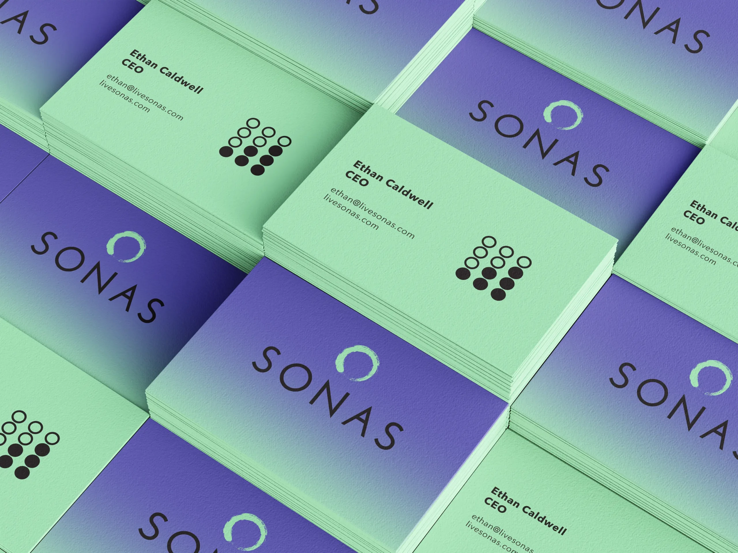
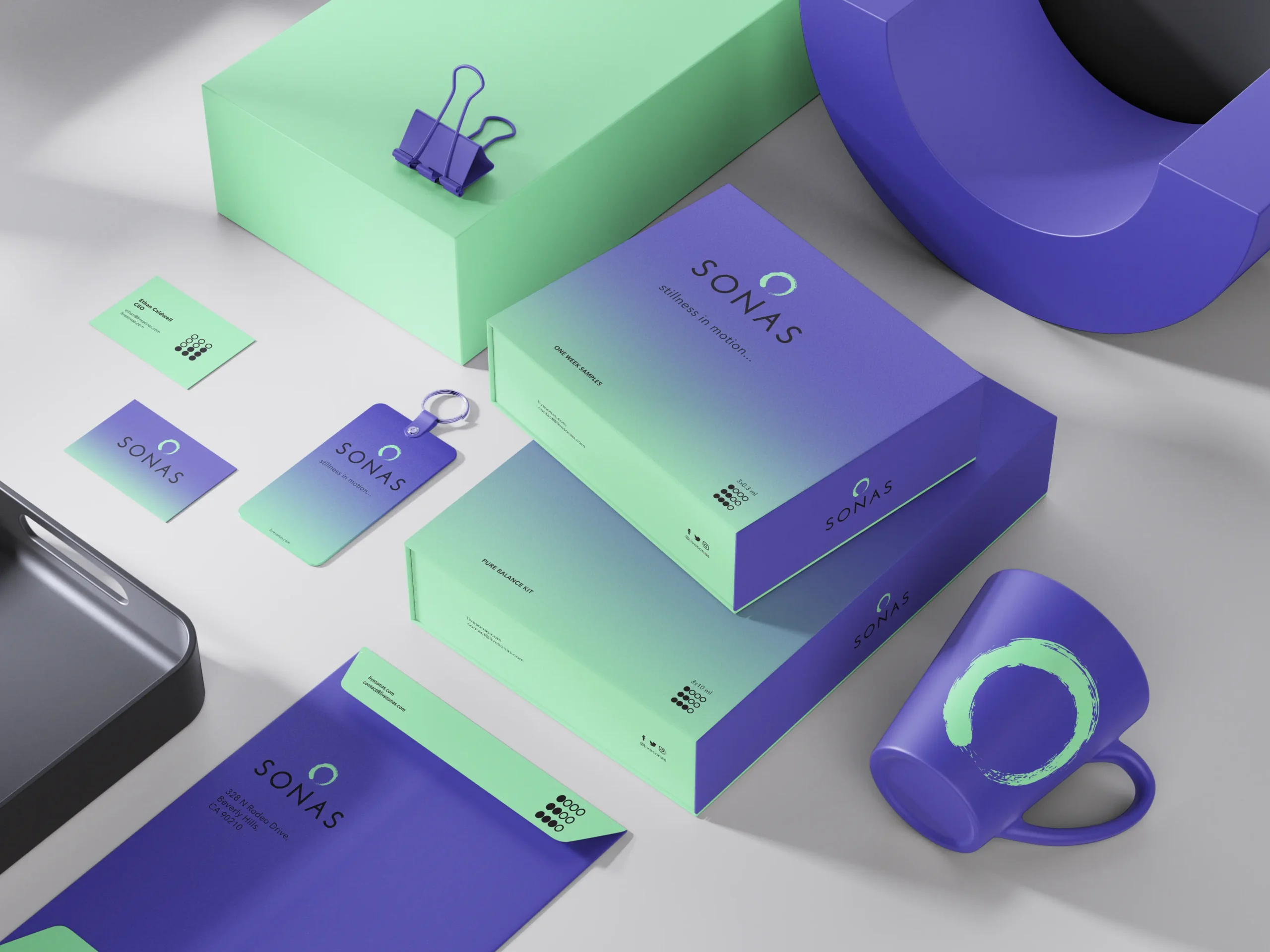
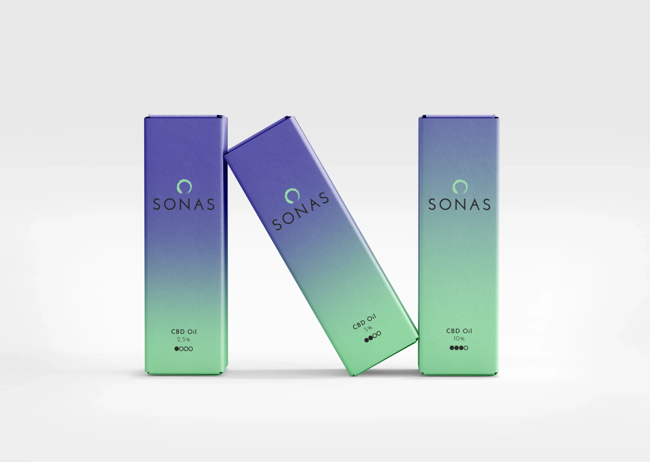
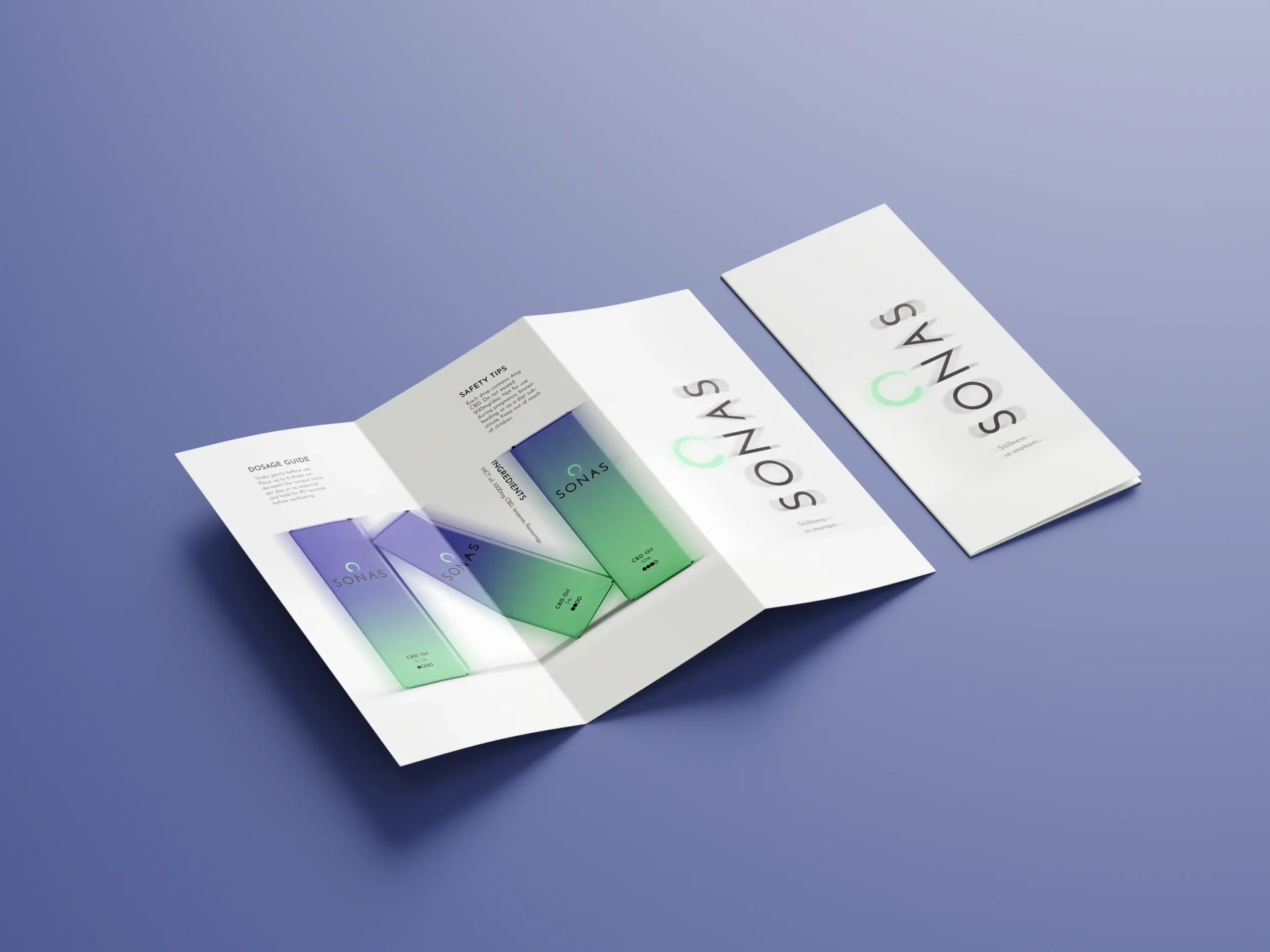
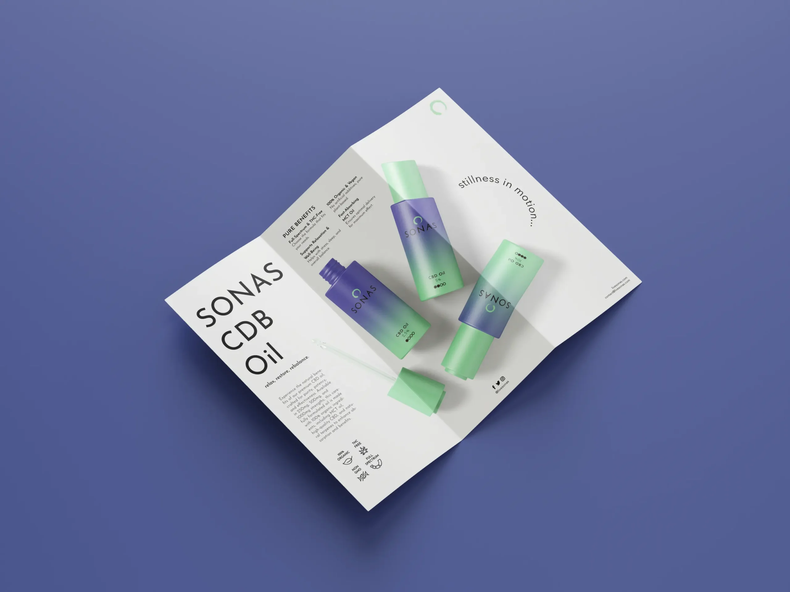
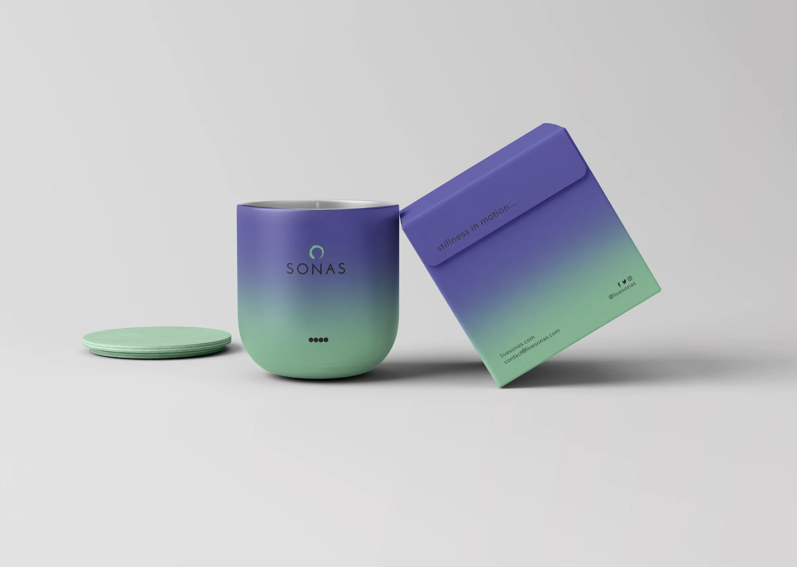
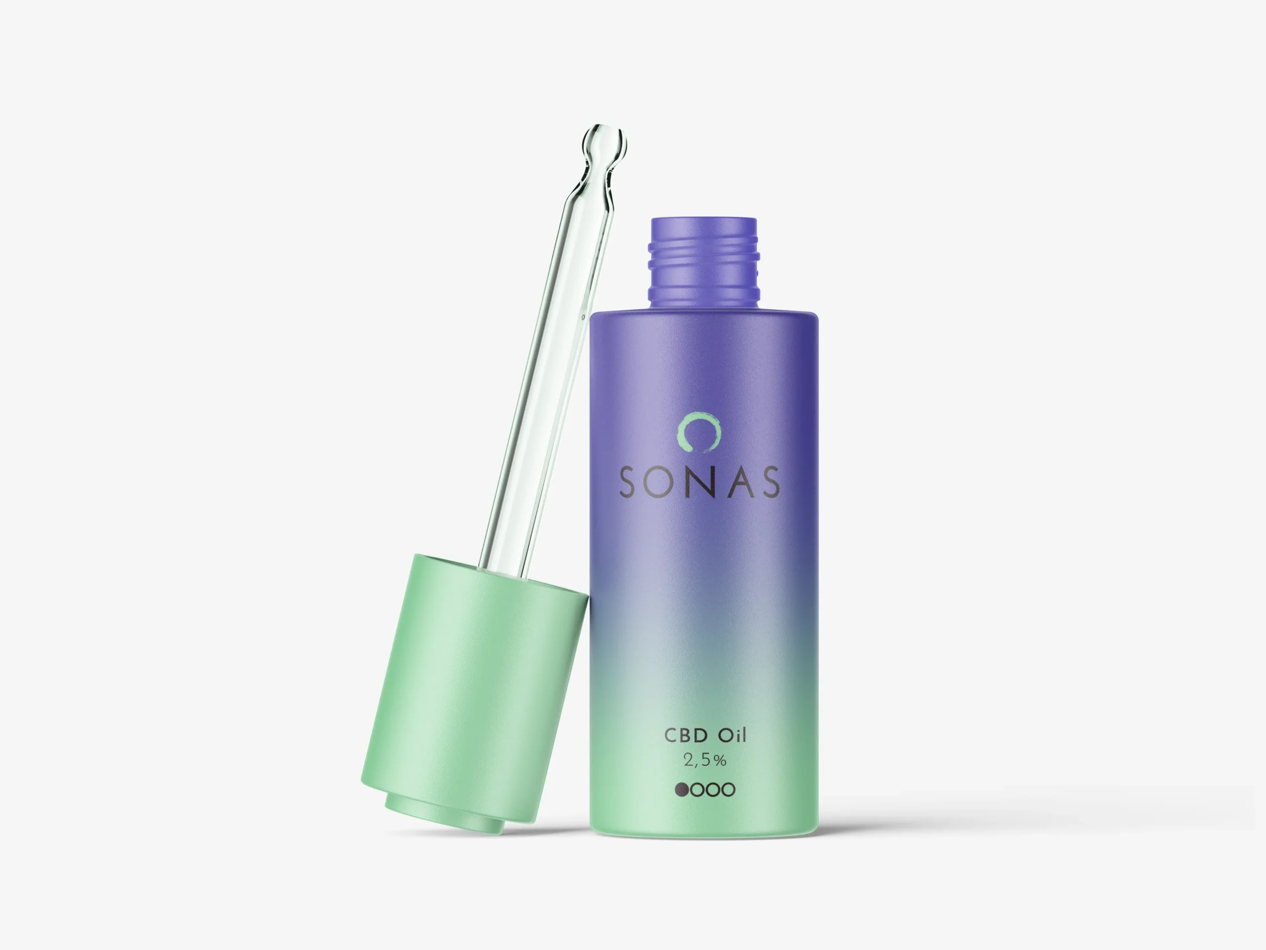
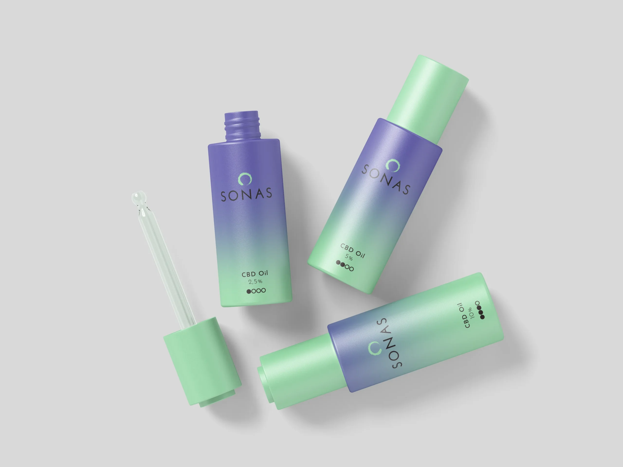
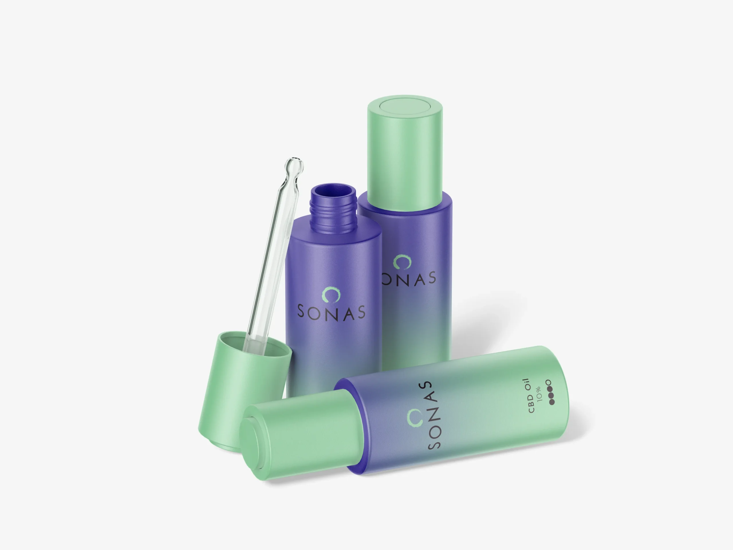
Sonas blends science and nature, offering nature‑friendly, clinically informed CBD solutions articulated through ‘stillness in motion,’ and, as a high‑end CBD oil brand, required premium packaging, print, and promotional assets to reflect its quality and wellness ethos with a cohesive identity.

Challenges

Developing a brand identity for Sonas meant balancing science and nature while conveying pure quality and wellness. The main challenges included creating packaging that truly reflected their high-end positioning, differentiating each CBD oil strength, and translating their ethos—“stillness in motion”—across both digital and physical assets. Ensuring consistency, clarity, and a premium feel at every touchpoint was essential to build trust and attract discerning customers.

Solution

Our approach combined strategic design and clear communication to elevate Sonas’s brand. We developed distinctive packaging for each strength level, implemented a unified visual identity, and ensured every element—online and offline—expressed purity and wellness. By blending modern aesthetics with natural cues, we brought the “stillness in motion” ethos to life, building a brand experience that inspires confidence and connects with customers seeking both science and serenity.

Deliverables